Onboarding Experiments
From a Product Tour Research completed in late 2018, we got to know Deputy trial users, their needs as well as the main onboarding gaps. I designed a number of different solutions that allowed us to run A/B tests and to improve their journey.
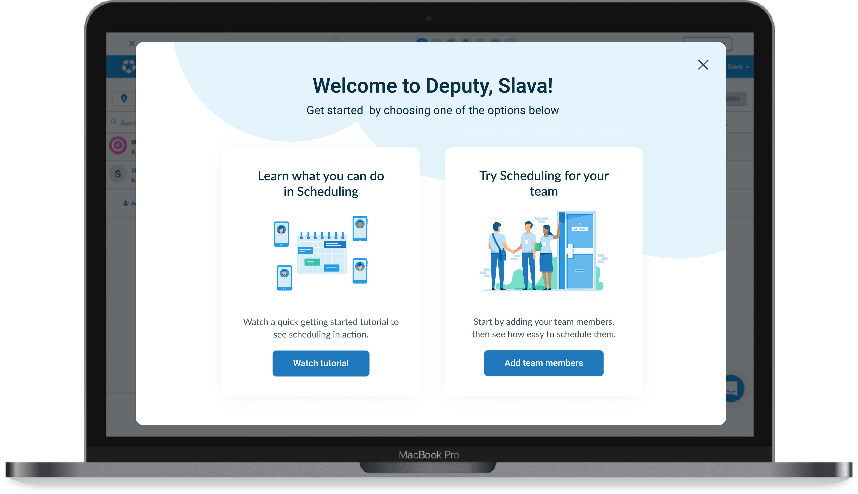
The challenge
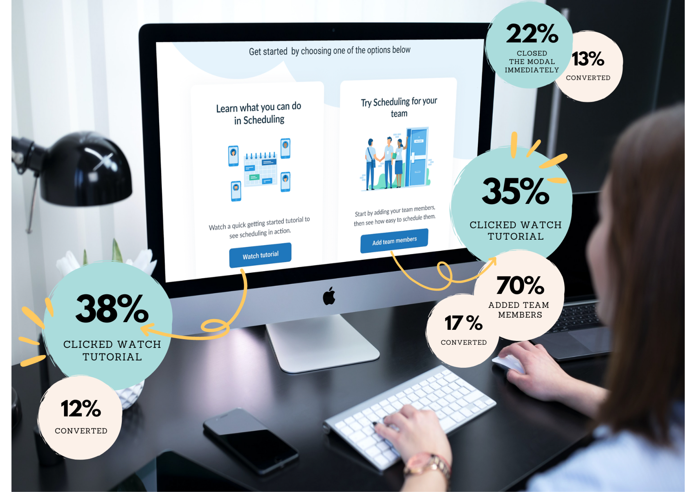
Deputy trial users were hesitant on which option they should choose by simply not understanding the difference and being afraid of making the wrong decision. This often made users feel incompetent and frustrated.
Our goal for this project was to help trial users who intended to see the product in action by surfacing contextual, personalised and industry customised data.
The original onboarding was designed to give users flexibility by enabling them explore the product through demo or pro trial:
- Demo trial: skip business set up and use a demo account, or
- Pro trial: set up business details to get started
My role
I was responsible for designing a solution that could onboard trial users by showing various values Deputy has to offer and build early trust.
One of the challenges of my role was to design a few small components that could provide instant value and quick implementation. Using small components allows ease of A/B testing as opposed to large end to end experience.
Solution
The following set of experiences were designed and developed for our trial users:
- All users will now enter their trial though one consolidated, 'Get Started' call to action. The, 'Skip and use demo account' call to action button has been removed
- Demo data available for those users who intended to see the product in action instantly
- Users are offered a clear starting point that helps to accelerate their learning
We expect these changes to improve desktop conversion rates, in particular, self conversion rates for no/low touch trials within our key segments and is the first step towards a fully personalised trial experience.
What did the process look like?
- Sketch session
- Jobs-to-be-done
- Wireframes
- Tech & Product
- User feedback
- User Interface
- Screen flows
- Front & Back End
- A/B test set up
- Data insights
- User feedback
Design kick off
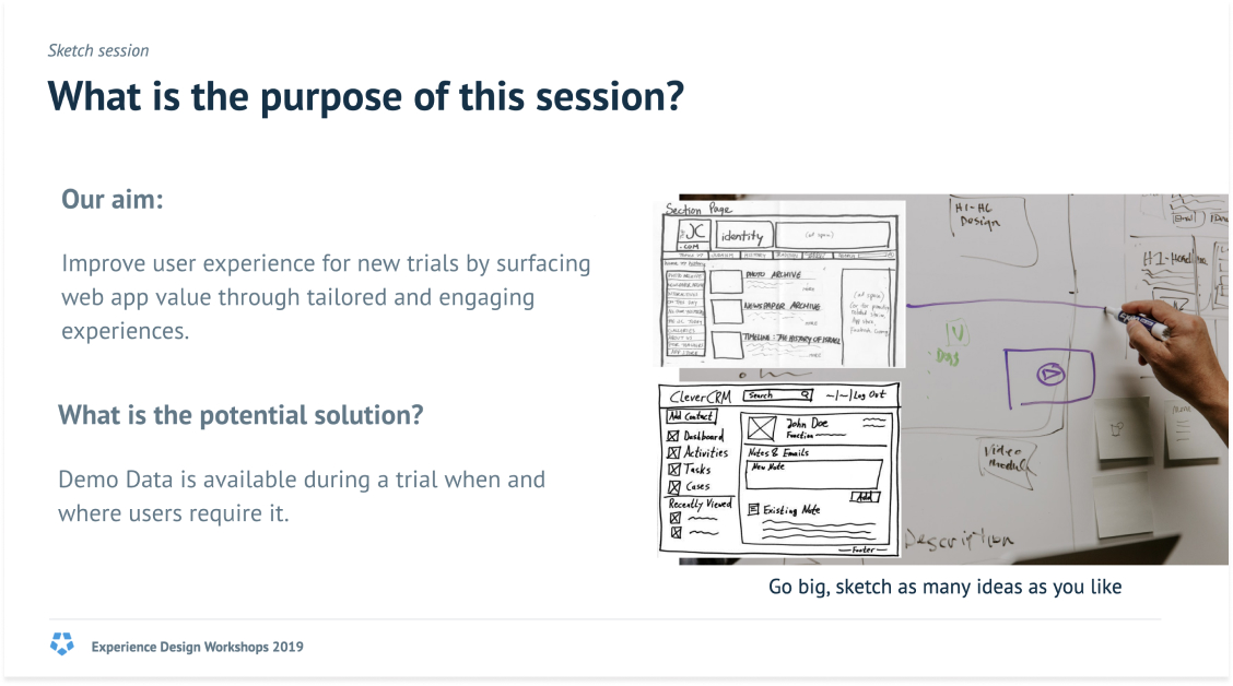
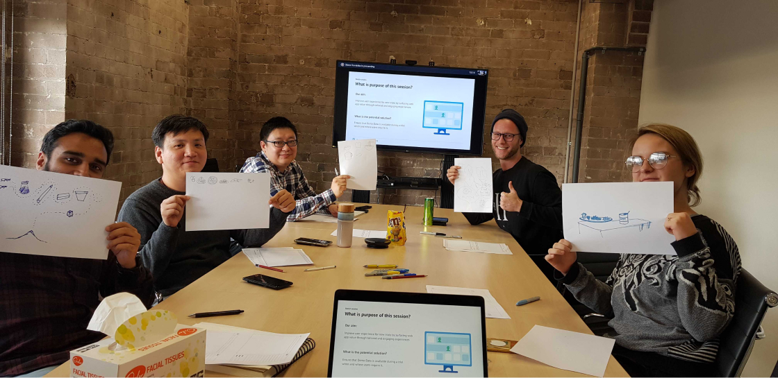
To kick off the design phase and brainstorm on as many as possible design solutions, I organised and facilitated a sketch session where everyone could share and contribute. Normally the best solutions are those that come from various perspectives, thus, I decided to involve people with different skillsets:
- Mobile Designer
- Product Designer
- Front End Engineer
- Back End Engineer
- Product Manager
- Stakeholder (Director of Growth)



Learnings
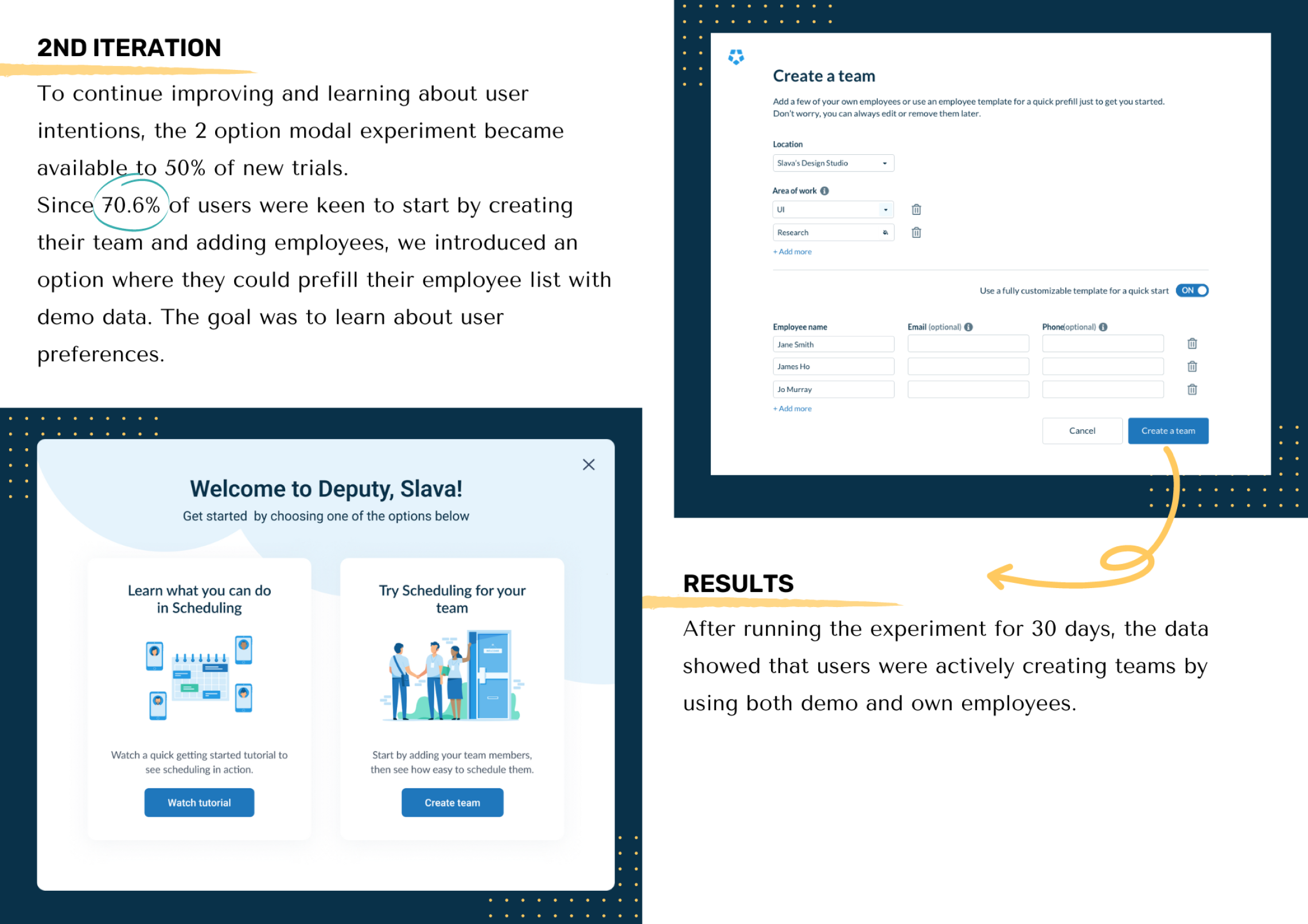
After a few rounds of testing, the following changes were made on the modal based on user feedback:
- ‘Get started’ copy on call to action button updated to, ‘Create a team’ as it’s a better respresentation of the action required. ‘Get started’ copy was also already used on a previous sign up screen
- ‘Book in a tutorial’ link was removed as users were not interested in that option, which proved to be an unnecessary distraction

Onboarding users with industry demo data
To present users with ongoing improvements during onboarding, we introduced the following features:
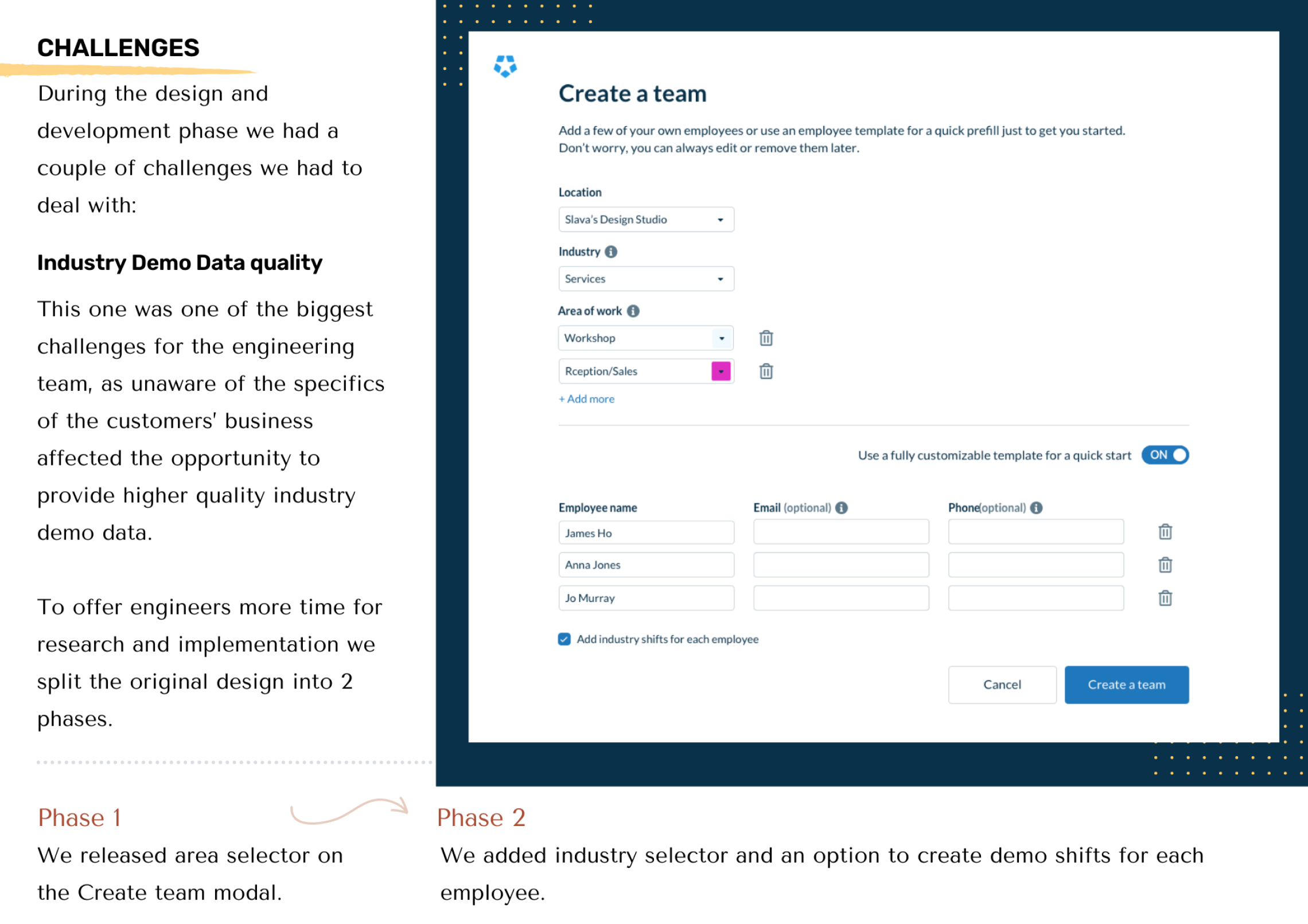
- Industry and area selectors added to the Create team modal where users can add or correct their industry if needed to produce relevant areas of work
- An option to ‘create demo shifts for each employee’ is available through an added checkbox in the Create team modal. Once the team is created, the whole week’s rosters will be auto generated using industry specific areas and shift times
- The People tab now shows demo employees in a separate table from the main employee list, where it is clearly stated that thedemo employees are free of charge and can be removed from the account if needed
- When a trial account with demo employees converts to a paid account, this instance will keep the demo employees and roll them over, free of charge
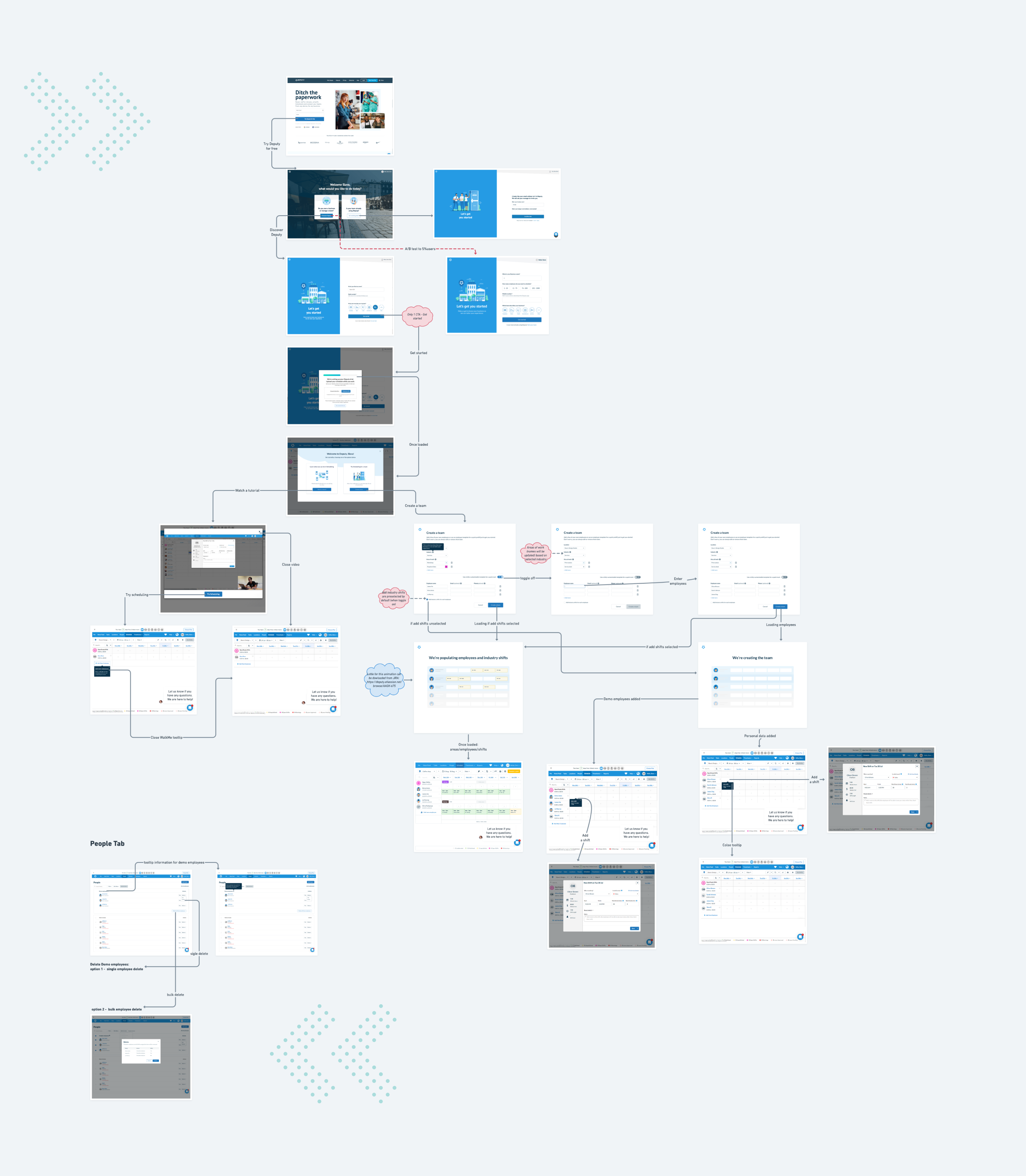
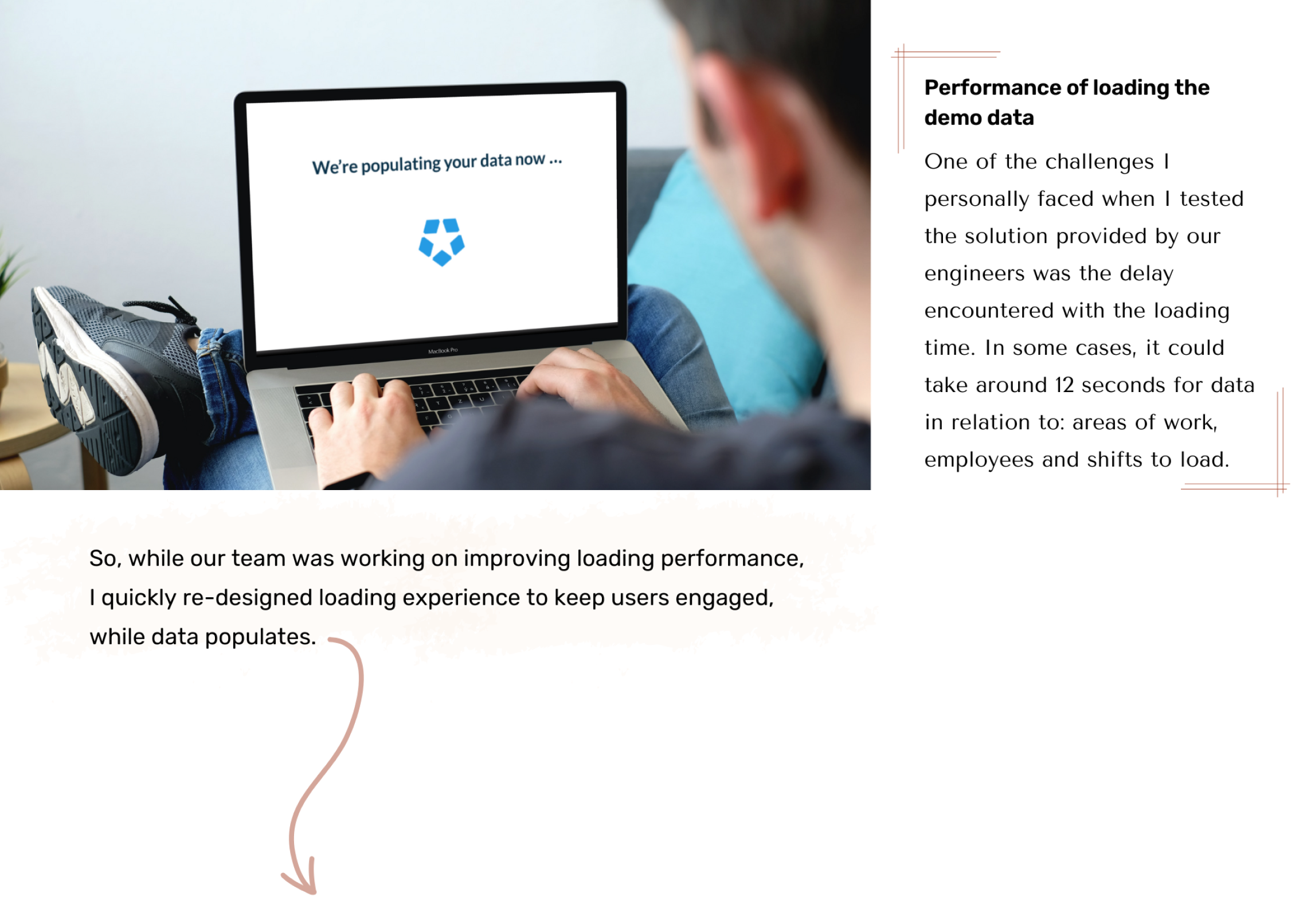
We're populating employees and industry shifts

Outcomes
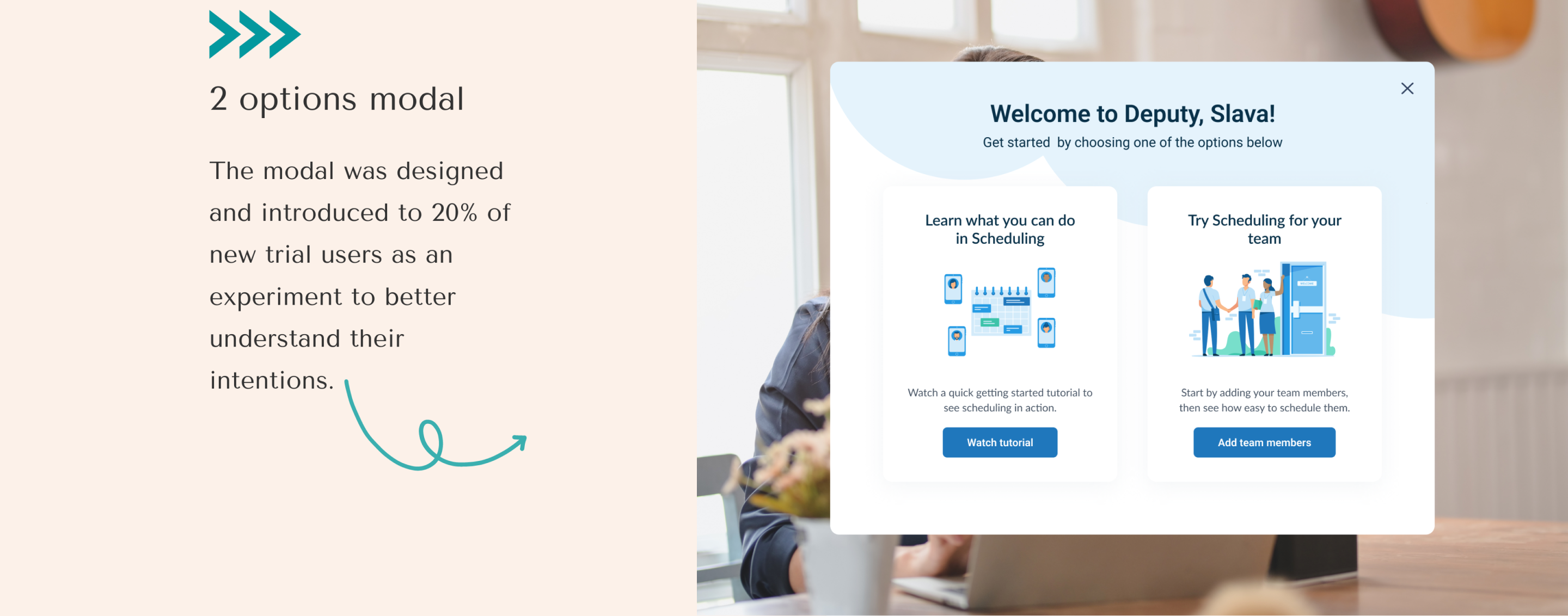
Two options modal, demo employees, industry areas and shifts were launched to all 100% of new trials to give them a clear starting point and instantly show the product in action.
The new onboarding experience was successful, it helped to reduce drop-off rates by 12%, increased product engagement as well as the self conversion rate to 23%.