Gamification redesign
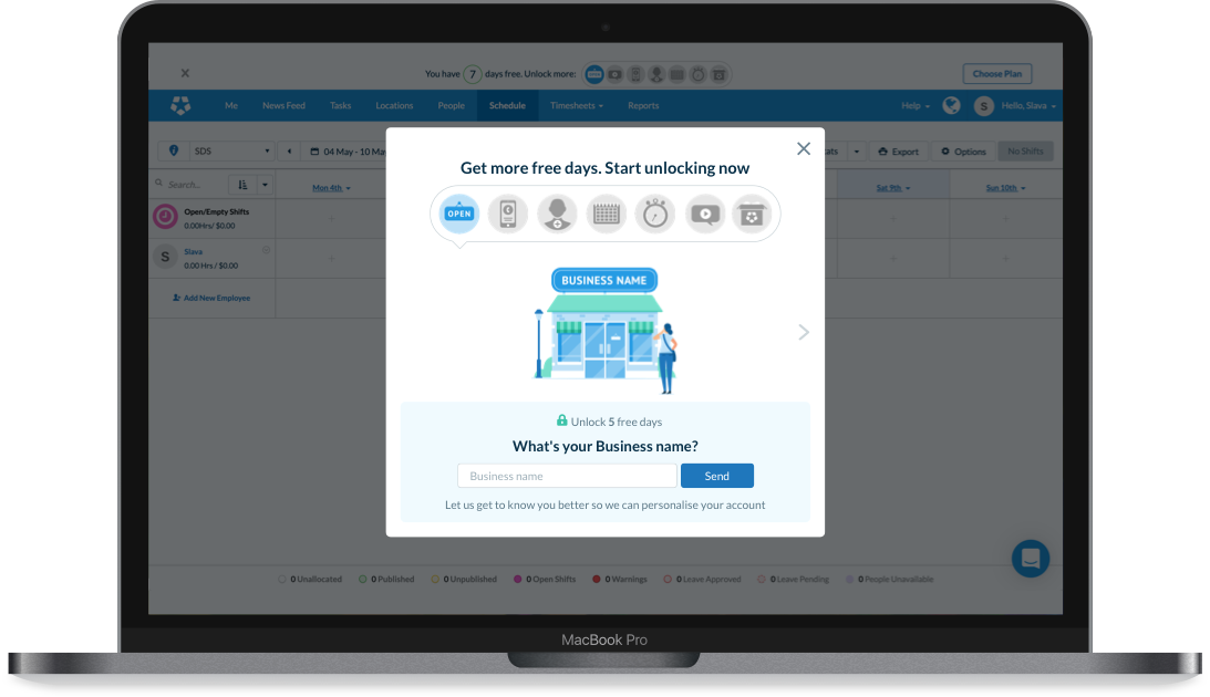
Deputy is a staff rostering software that helps manage schedules from any device. To accelerate user learning and facilitate engagement with the product, particulary during a free product trial, the company uses gamification.
Business goal
Many products offer an initial free trail, but we offer our users the ability to unlock more free days which brings them some sense of achievement and entertainment.
The main goal for this project was to increase current user engagement with the product through gamification games.
My role
I was responsible for reviewing and proposing improvements to current user experience, as well as user interface, following the company brand guidelines.
Solution
The following changes were introduced:
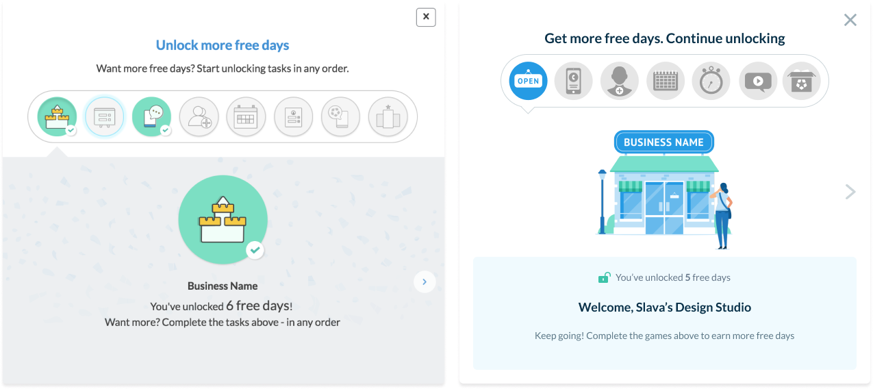
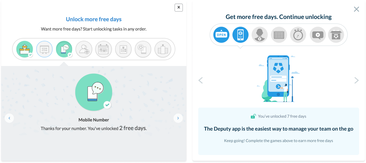
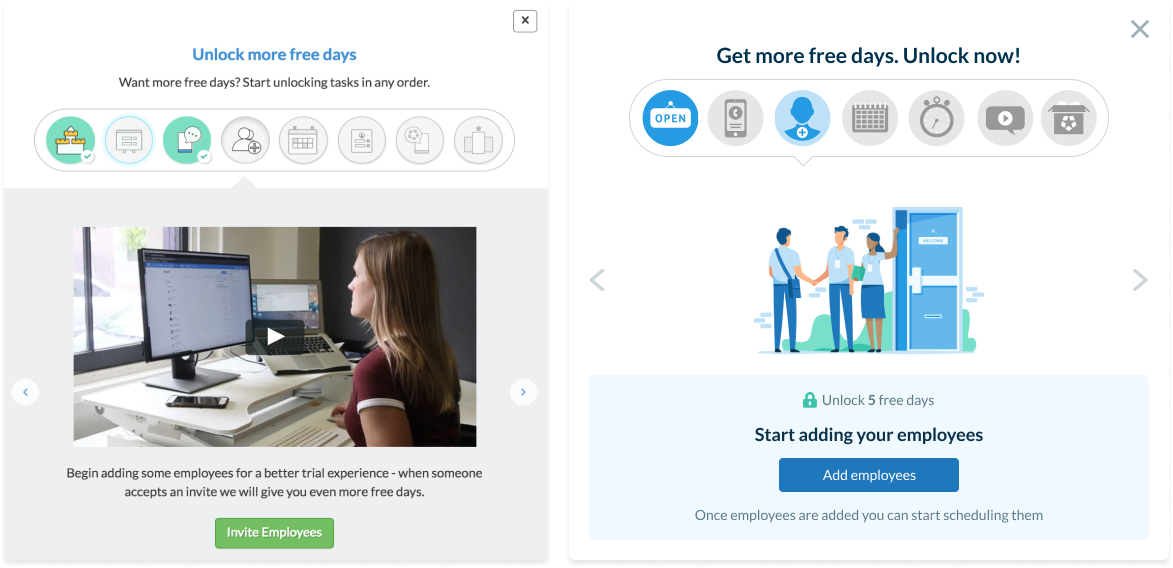
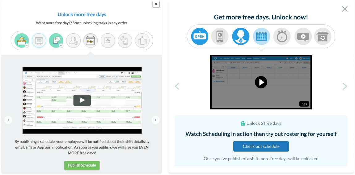
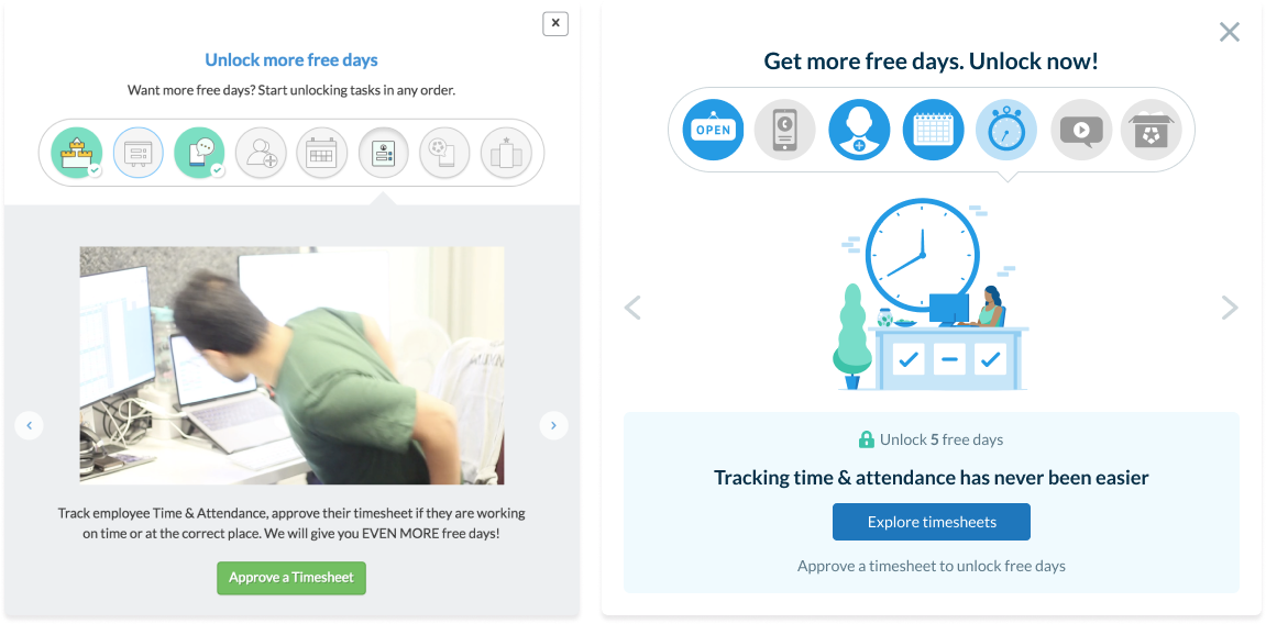
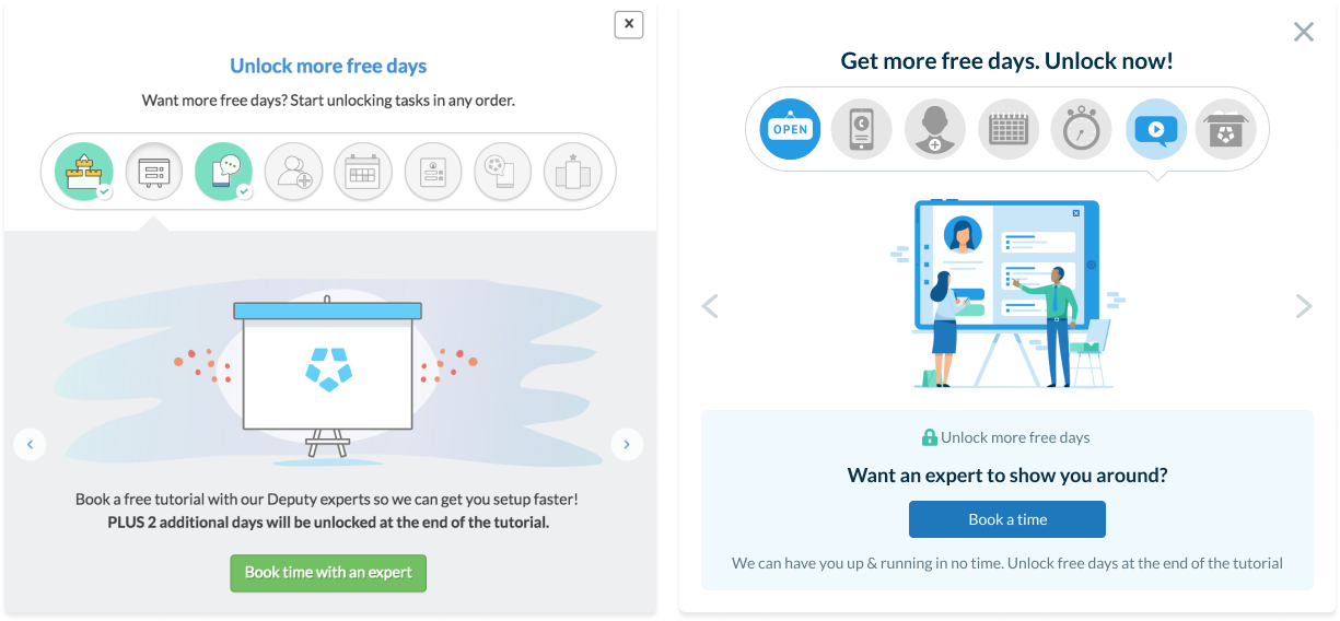
- In our copy review, users now have a clear explanation of how certain tasks benefit them
- We replaced any outdated videos with cutting-edge, clear illustrations, and the singular video we now provide, gives users simple information to process more easily
- Plus the combination of 2 games into 1 ( mobile phone number and app), offers them a more beneficial experience
What did the process look like?
- Data analysis
- User Interface
- User feedback
- Front & Back End
- A/B test set up
- Data insights
- User feedback
Data analytics review
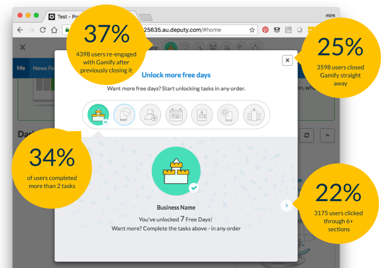
Before jumping into design mode and crafting new experiences, I watched a number of FulStory recordings and went through some data, to uncover opportunities and prioritise improvements.
UI Design
Looking at the data and talking to customers made it clear, that a lot of people were overwhelmed and not sure what they should focus on.
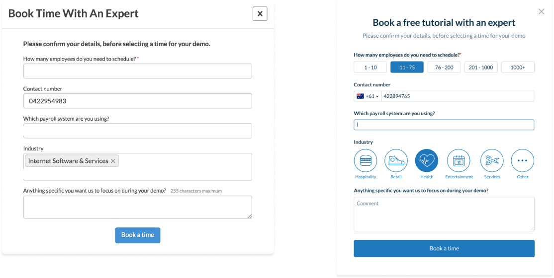
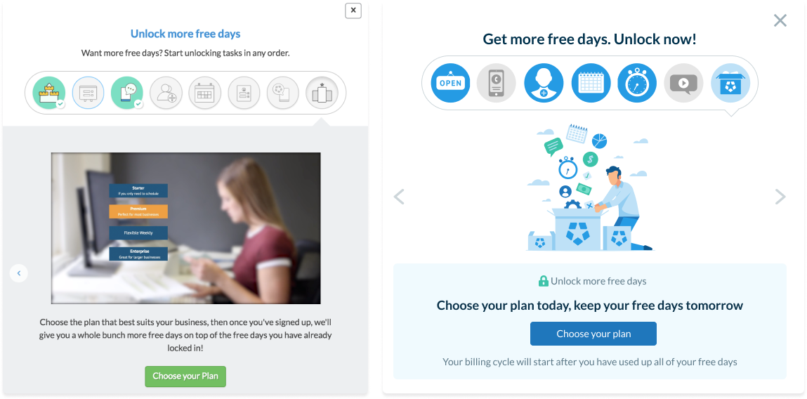
Game sequence challenge
A small challenge I faced was when, in the new design, I proposed to change the game sequence. Some people thought, ‘Book a demo with an expert’ should be the first contact with us, not the last. I personally believed that potential users should first explore the basics themselves, so they can dive deeper with a Deputy expert later, as booking a demo is more an extention of an introduction to the product where users can get any product clarification they need.

The agreement was made to find out in reality, rather than theory and learn from our users what works best.
So, we offered 50% of new trial users, ‘Book a demo with an expert’ first, and the other 50%, ‘Book a demo with an expert’ last.
Outcomes
The new design created an attachment to the product which translated into loyalty to our subscriptions and an increase to self and overall conversion rates.
It also helped us, as a team, to gain a deeper understanding of how users explore and prefer to interact with the product.